*3 min read
We often sound crazy. And then we’re right. Why we’re always too early – and proud of it
Back when most people doubted AI in design, we were giving talks about it. Years later, those bold ideas are becoming real.

You’ve got something that matters. We’re here to take it further — with care, clarity, and the kind of outcome that makes you smile in disbelief. Tell us what’s on your mind, and we’ll get back within 1–2 days.


.png)
Forms are essential tools for capturing leads, signing up users, and completing transactions. However, poorly designed forms often lead to frustration and high abandonment rates. The good news? With a few smart UX tips, you can design forms that convert more effectively and provide a seamless experience for your users.
In this guide, we’ll focus on five key steps to help you create high-converting forms that not only reduce friction but also encourage users to take action.
Forms act as the final barrier between user intent and action. Whether you're asking for a simple email signup or gathering detailed information for a purchase, the design of your form can make or break the user’s decision to complete it. A cluttered, confusing, or overly complex form is one of the quickest ways to lose potential leads or sales.
Good form UX reduces cognitive load, minimizes effort, and guides users seamlessly through the process, ultimately improving your conversion rates. By streamlining your forms and focusing on the user, you can increase submission rates while keeping the process simple and intuitive.
One of the most important factors in form conversion is simplicity. The fewer fields you have, the more likely users are to complete your form. Each field you add creates additional friction and increases the likelihood that users will abandon the process.
Example: Instead of asking for a full address during an email signup, simply ask for the email address and add more fields later in the user journey.
More than half of web traffic now comes from mobile devices, so mobile optimization is essential. A form that looks great on a desktop but isn’t optimized for mobile will cost you valuable conversions.
Example: Use responsive design to ensure that your form adjusts seamlessly across different screen sizes. Ensure your buttons are large enough to tap with a thumb and space out fields to avoid accidental clicks.
Users shouldn’t have to guess what information you’re asking for. Clear, concise labels and instructions are key to guiding users through the form efficiently. When users know exactly what’s expected of them, they’re more likely to complete the form without errors.
Example: Instead of labeling a field “Contact Information,” break it into specific fields like “Phone Number” and “Email Address.” If users need to meet specific requirements (e.g., password strength), let them know upfront.
Your submit button is one of the most important elements of the form, as it represents the final step the user must take. A vague "Submit" button isn’t enough. Use action-oriented language that clearly explains what happens when the user clicks.
Example: Instead of using a generic "Submit" button, try a more engaging CTA like "Start My Free Trial" or "Join the Newsletter."
Users often abandon forms when they encounter errors that aren’t addressed until after submission. Real-time validation helps users correct mistakes as they go, reducing frustration and improving the likelihood that they’ll complete the form.
Example: If a user enters an invalid email, display a helpful prompt like, "It looks like your email is missing an '@'."
The simpler the form, the easier it is for users to complete it. Forms that ask for too much information, or that require users to make complex decisions, tend to have lower completion rates. Cognitive load refers to how much mental effort a task requires, and it’s essential to keep it low for high-converting forms.
Users are more likely to fill out forms when they feel secure. Displaying trust signals, such as security badges or privacy policies, reassures users that their data is safe and that they are dealing with a legitimate business.
One of the biggest factors in form completion rates is the length of the form itself. Users are far more likely to finish short forms than long, detailed ones. But how do you balance gathering the necessary information without overwhelming users? This section would explore the importance of keeping forms short and how you can break up longer forms into manageable steps to increase conversions.
Small bits of text, known as microcopy, can make a big difference in user experience. Microcopy helps guide users through a form by offering instructions, clarifying field requirements, or providing reassurance. In this section, explore how adding effective microcopy can lead to higher completion rates and a more positive user interaction.
Designing high-converting forms doesn’t have to be complicated. By focusing on simplicity, optimizing for mobile, providing clear instructions, and offering real-time feedback, you can create forms that encourage users to take action and reduce abandonment rates.
Remember, every extra field and every bit of confusion can lead to a lost opportunity. Start by simplifying your form, optimizing for all devices, and guiding users smoothly through the process. With these UX tips, you’ll be well on your way to creating forms that convert more effectively and improve user satisfaction.
Back when most people doubted AI in design, we were giving talks about it. Years later, those bold ideas are becoming real.
.png)
What follows is not written with any help of AI, it’s not following any guidebooks, cold email strategies, or any of these generic email bullshits.

AI-first is nonsense. We know it sounds modern and smart and techy. Here's why our studio will never be “AI-first”.

Formerly ČOSIV, this organization has been doing the hard work since 2011: advocating for inclusive education, supporting kids at risk, promoting mental wellness, and pushing for systemic change in the Czech Republic.


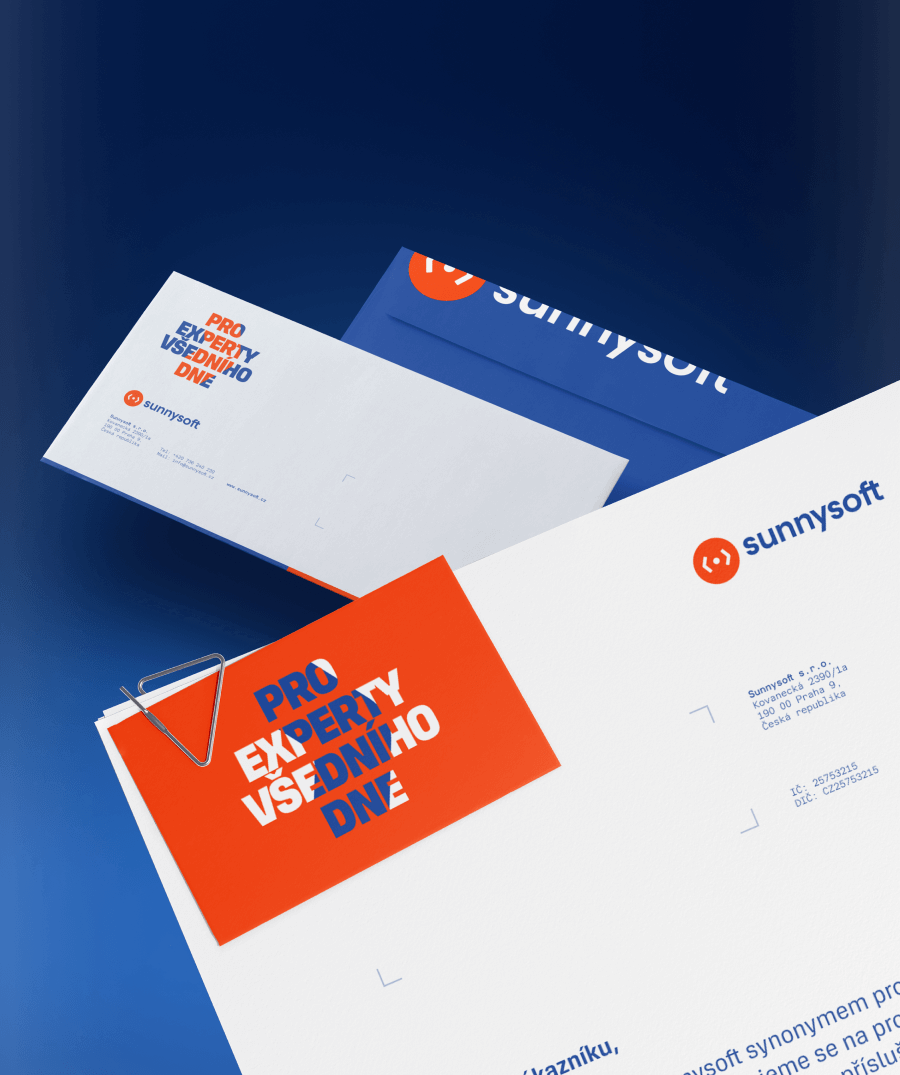
We helped Sunnysoft go from safe and forgettable to bold and unmistakable. With a new visual identity, sharper type system, stronger colors, and a clear message.
We don’t believe shopping centers should look like they were designed by committee. That’s why for Arkády Pankrác, we did the exact opposite. We simplified. We amplified. And we made it unmistakably visible.

Scroll through LinkedIn, and it’s all about wins, growth charts, and scaling. And sure, success is important. But in the kind of work we do – design, branding, products – the story’s a bit more complicated.
.png)
Every magazine starts with a blank page — but Luxury Travel Digest started with a vision. Not just to create another travel publication, but to build something timeless.
.png)
You’ve probably heard “Find your why.” before. Well, chances are most of you got it wrong. Our studio was the same.

NachoNacho is a US start-up based in San Francisco. It's an all-in-one platform that combines SaaS and subscriptions, along with its own marketplace.

Three years ago, it started with a sketch. Just a simple dashboard layout – rough thoughts on how a user in Qatar or Oman might one day send money, pay a bill, or shop with a tap.

Liberální institut was founded in 1989, the same year as the Velvet Revolution. Since then, it’s stood for personal freedom, free markets, and individual rights – becoming one of the most important voices for liberalism in the Czech Republic.

Let’s be honest—most people think branding is just “making things look nice.” A pretty logo, a trendy color palette, maybe a sleek font. Done, right?
.png)
In the fast-paced world of startups, great design is a game-changer. From seamless UX to branding for startups, the right approach can position a fledgling company as an industry leader.
.png)
Think your brand isn’t important? Go ahead, keep blending in with your competition. We’ll be over here turning branding into cold hard cash.

Found a new spot that’s Instagram-perfect and wife-approved. But just when you're ready to impress… things don’t quite go as planned.

The idea that users form a lasting impression of your website or brand within 7 seconds is rooted in neuroscience and psychology.

A great user experience (UX) isn’t about flashy designs or the latest trends—it’s about creating a website or product that makes it easy for users to achieve their goals.

When you hear conversion rate optimization (CRO) and user experience (UX), they might sound like separate strategies.


If your landing page isn’t converting visitors into customers, chances are it’s not a user experience (UX) problem, but a landing page UX problem.
Starting a new venture is exciting but also comes with its fair share of challenges

How do you know the site is working for your users?

A well-designed user experience doesn’t just make your customers happy—it also boosts your bottom line.

In today’s digital world, having a great website or app isn’t just about looks—it’s about how well it works for your users.

Knowing exactly what your users need, want, and struggle with can make or break your business.

In the world of digital marketing, landing pages are one of the most powerful tools at your disposal.

What exactly is the difference, and why are both wireframes and prototypes so important in UX?
Thumb-friendly navigation is the bold departure from the so-called natural scrolling that has dominated our digital experiences
We’re not making the best use of the wider horizontal screens of desktops and laptops

Have you ever visited a website and just felt lost

A revolution in AI UX is happening and it’s about time you knew.
